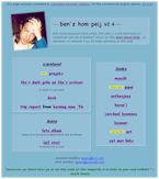
| in 1995, i made this simple page, tables and text and one image |  |
it was OK |
(all the old pages are still online and alive.. click 'em)
Plain Page
Experimental Page
Experimental Page (modified)
Site Map as Home Page
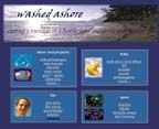
Ultimately...
| i decided to give my site a name
("washed ashore") - an attempt
to give the site more human feeling i don't want to just put out a bunch of dry mental exercises - this is my life on these pages! |
 |
| to me, personal
writings on the web are something like messages carefully
tucked into bottles and cast adrift - never knowing if
anyone might read them - never knowing whose silicon
shoreline they might wash up on since this bottle has washed ashore on your beach, won't you please email me and let me know what you think and feel? |
|