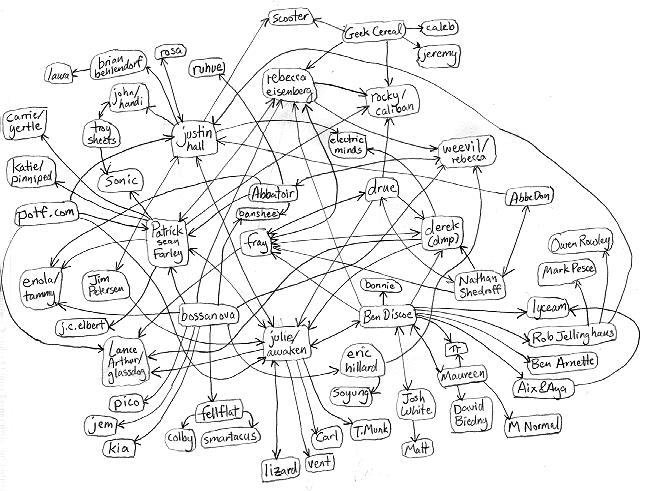
First, i created this map. It should be fully clickable. It gives some feeling for what the more linked sites were surrounding my site. With a map like this, a websurfer could jump ahead by several links in any direction without waiting for the intermediate pages to load. However, only a few connections are shown - the actual web is much more convoluted..

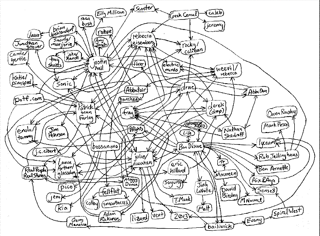
I then made this map, which shows many more links, but starts to suffer from information overload. The links get crowded and tangled; it's hard to see the immediate neighborhood for each site.

Maybe using the third dimension would help.